Responsive grid
WRI project websites use a 12 column grid (six on smallest devices). This grid makes it easy to create elements with different widths and place them in the design in a structured and organized way.
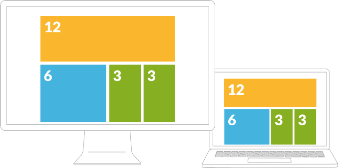
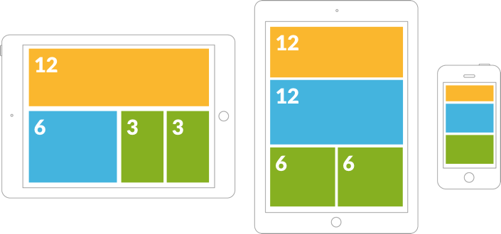
These are some examples of possible configurations for contents of the 12 column grid

Desktop displays

Mobile devices
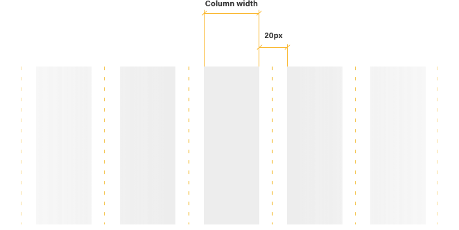
Each column is composed by a variable width that changes with the display size and a 20-pixel gutter. There are three cases for a screen up to 1200 pixel-width, the maximum allowed. If the screen is wider than that, the content stays centered. If the screen is smaller than 720 pixels, the content adapts to a mobile device layout with an elastic columns grid.

-
Screen widthColumn width
-
> 1260 px70 px (1080 px)
-
1260 - 960 px60 px (960 px)
-
960 - 720 px40 px (720 px)
-
<7201/12
Responsive design example
Desktop

Tablet
 Mobile


