Maps
A set of basemaps that will satisfy a variety of different user needs has been collated for you to use in your projects. If you need to add or change anything, feel free to do so and share your basemap as others might find it useful as well.
Using a consistent visual style for the maps is key to achieving the desired consistency throughout the WAI projects. The range of projects we need to take into account and the data each project needs to show requires a very versatile basemap system. We have four basemap styles that can be used for different purposes, and a method to slightly customize them to better fit each project.
Map user interfaces
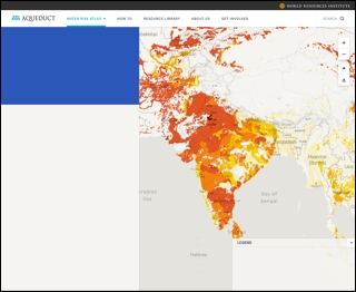
When the map view is accompanied by analysis tools or high complex features, a sidebar should be the place for collecting those interactive elements.

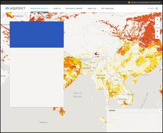
When the map view has just a few layers or a narrative paragraph for providing context, there should be a box for placing those elements. In these cases, the legend would be optional if the narrative contains information enough.

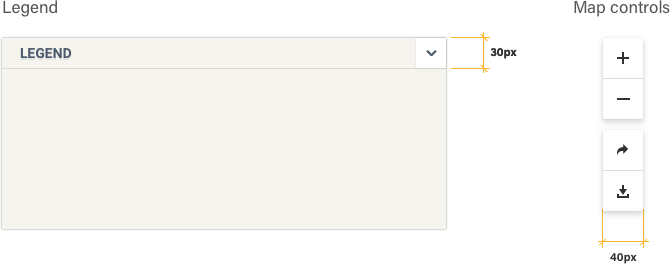
Map elements

Examples
Click on the thumbnails to see how the navigation looks when applied to a real-life project.
Use of maps
Default - Light add Dark
The default basemaps that should be used in most of the projects. A clean and low-key style that puts the focus on the actual data showcased on the map.
Helper layers
Terrain
Water
The water basemap. with a strong contrast between water and land surfaces to help users focus on water related data visualisations.
Satellite
Beautiful satellite imagery can help making users care about the planet our efforts are trying to protect. Satellite shouldn’t be the default basemap in analytical data visualisations.


