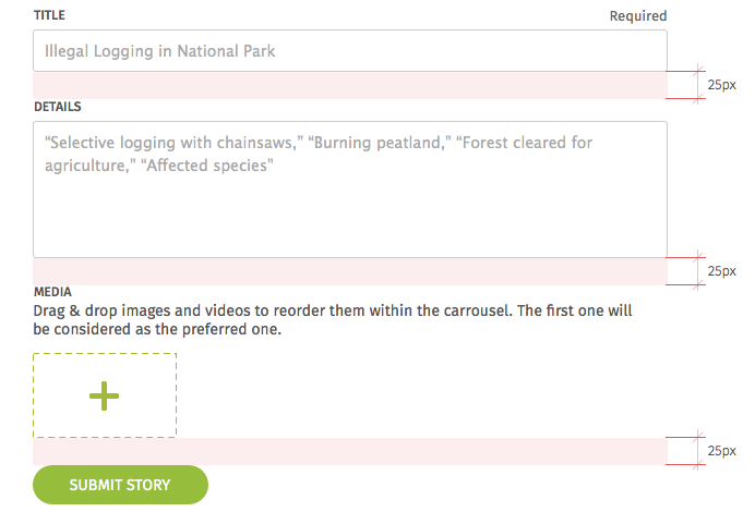
Forms are composed of text fields, text areas, selectors, radio buttons, and more. These elements are designed to allow building a new form fast and easy.
Please request access to the UI Kit Invision project for a full inspection of all these elements. Preview UI Kit

Text field

Text fields are used when we need a text input from the user. It can be accompanied by these elements:
- Label: Placed over the text field, it is its title.
- Placeholder: It displays in the text field until the user writes something there. It usually suggests what kind of information the user is expected to input.
- Hint: It adds information about the field, usually requirements or instructions.

Text area

Text areas are useful when the amount of information asked for is bigger than what would fit in a regular text field (e.g. comments, opinions, etc.)
File select

This element is used in forms where the user is asked to upload files from their computer. When the file selection button is pressed, the browser’s file explorer opens allowing the user to choose the files.
The description is used to add some information or instructions to the form element. It can also be used with text fields, text areas, etc.
Submit Button

Every form needs a submit button so the user can send the information to the server. Use a primary button for this.
Please request access to the UI Kit Invision project for a full inspection of all these elements. Preview UI Kit