Links and buttons are used to allow navigation between different pages of the website. Regular links are usually used within paragraphs while buttons, on the other hand, are used independently, calling for an action.
Please request access to the UI Kit Invision project for a full inspection of all these elements. Preview UI Kit
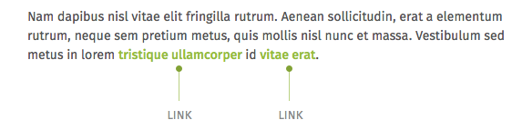
Links
Regular links are usually used within paragraphs. They are green and slightly thicker than the rest of the text to differentiate themselves and be easier to identify.
Buttons
Buttons are used independently, outside of text blocks. They are much more striking than simple links, and they usually call to an action (“See more”, “Download”, etc.)
There are two types of buttons which are used depending on the importance of the action to call. The primary buttons are green and flashy so they are very easy to see at first glance. The secondary buttons are, on the other hand, more conspicuous as they only use a thin border to identify themselves as buttons.
There are also alternative buttons to be used at certain places (for example, the dark button is used on the related content module, while the huge button is used on the Home.)

Please request access to the UI Kit Invision project for a full inspection of all these elements. Preview UI Kit