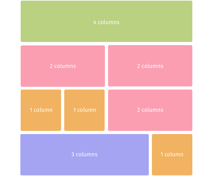
The Global Forest Watch website uses a 4 column grid. This grid makes it easy to create elements with different widths and place them in the design in a structured and organized way.
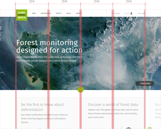
Each columns measures 25% of the overall width. The page adapts to the screen with up to 1200 pixels, the maximum allowed. If the screen is wider than that, the content stays centered. If the screen is smaller than 850 pixels, the content adapts to a mobile device layout.
These are some example of possible configurations for contents of the four column grid: