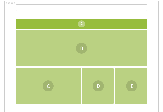
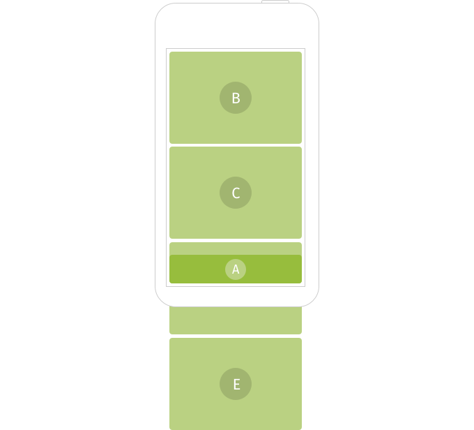
All responsive adaptations are module-based. The modules adapt their design to fit the device’s screen, and stack one on top of the next.

All responsive adaptations are module-based. The modules adapt their design to fit the device’s screen, and stack one on top of the next.